JNA...

Hallowell

Responsive Website Design

With over a century’s experience manufacturing and shipping industrial shelving throughout North America, Hallowell’s catalog is thick. Wanting to give their customers access to the company’s ever-evolving product customization options and stock inventory, we embarked on a complete website redesign. The results…happier, informed customers with real-time access to options and availability plus empowered employees with intuitive backend content editing capabilities. 

My Role: 
  • Apply Creative UX Design Philosophy
  • Utilize server-side and client-side languages
  • Coordinate and manage development team 
  • Communicate with client
Date: 
DEC 2022 - JUL 2023
Project Goals: 
  • Connect company manufacturing plants and distribution centers
  • Establish a digital repository for all product information, documentation, and photography
  • Empower employees with straightforward backend controls necessitating only a minimal need for onboarding
  • Organize product data in a way that is intuitive and provides effortless access to SKUs and statistics
discovery

Gathering vital information and conceptualizing my plan

I was tasked with building a dynamic online catalog capable of displaying product specifications for over one-thousand unique SKU’s. My client needed their site to be mobile-friendly and to possess intuitive backend controls. After thorough research, I carefully curated a list of questions for stakeholders. Effectively utilizing my limited time with company executives, I walked away from our initial meeting knowing the following:

  • features of their current site they love and gaps they want to fill
  • collective opinions regarding specific competitor sites, in terms of both visual aesthetic/layout and features/functionality
  • users can be divided into three categories (select employees, dealers, and the general public) that will interact with the site in different ways

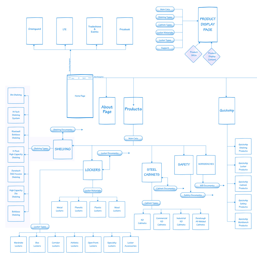
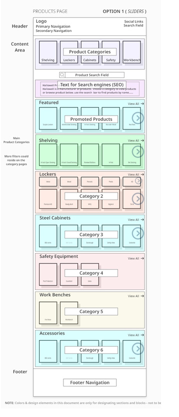
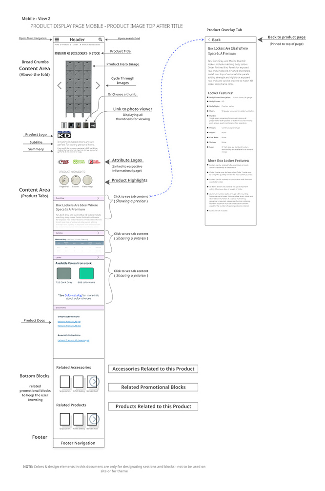
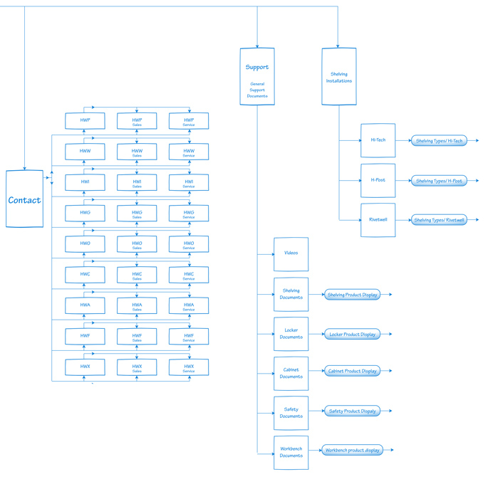
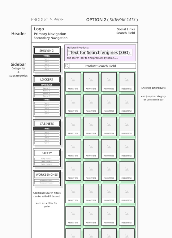
Following our initial meeting, I constructed multiple flow charts to concretely visualize the catalog hierarchy. Next, I developed user flows and wireframed the main sections of the site. Luckily the wireframes met the client’s expectations and we could exceed their functionality expectations.

prototype

Comprehensive testing drives development team

Using my approved wireframe plans, I created high-fidelity prototypes of multiple color stories and layouts for client feedback. I also gathered non-biased user feedback from a small testing group. My hi-fi prototypes allowed users to interact with the following features:

  • menu slide-in/slide-out
  • horizontal scrolling cards
  • button effects
  • operational local links

I used the invaluable user feedback to streamline navigation and rework user trouble spots before moving to development.

evaluate

Surpassed expectations make for happy clients

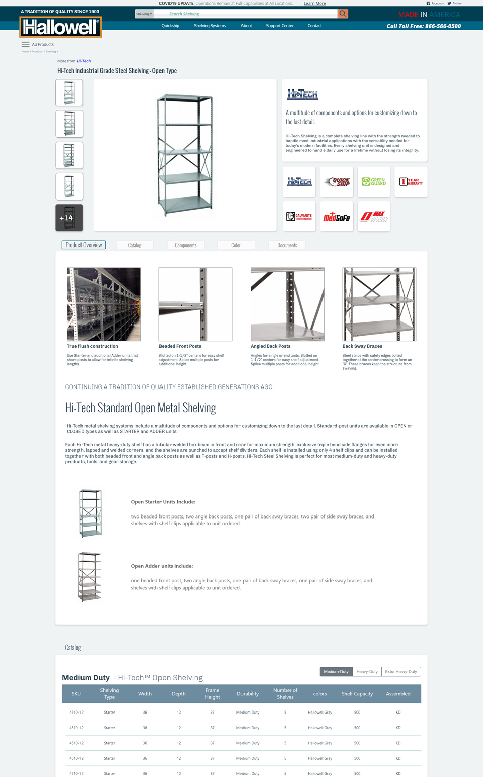
Reflecting on the final product, it certainly doesn’t look how the client had first envisioned it. I effectively used mock-ups to illustrate the site’s visual potential and inspired the client to think beyond their original scope. The site fulfills all client expectations and the company's stakeholders are thrilled with its aesthetic and functionality. Additionally, the new site allows company employees to make site changes in-house...game changer.